




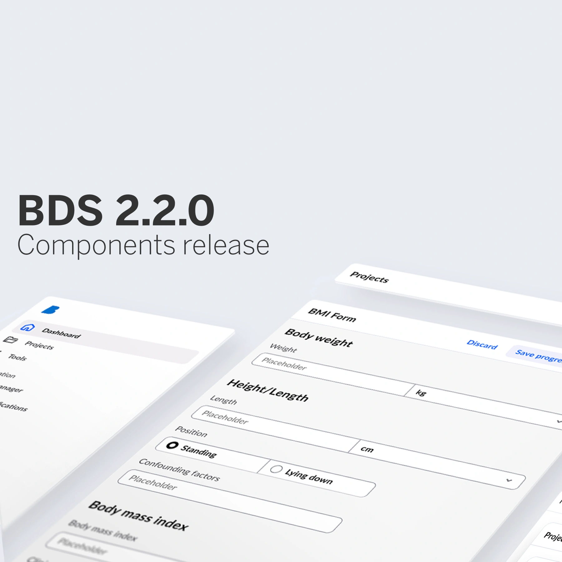
BDS 2.2.0 brings full component level design token coverage across every component and two new structural components, Top bar and Side navigation, alongside a set of meaningful improvements to existing components.
Healthcare applications need consistent, adaptable interfaces. BDS 2.2.0 delivers on both fronts: Full design token coverage across every component, and two new structural components, Top bar and Side navigation, that give teams the building blocks for complete application layouts.
New components: Navigation that fits the whole picture
Two new structural components join the library in this release, and they represent something of a milestone for BDS. Navigation has always been one of those patterns that teams had to handle outside the system. The components for content, forms, and data were there, but the scaffolding that holds an application together, the top bar, the side navigation, was left for each team to solve independently.
That meant inconsistent implementations, duplicated effort, and navigation patterns that sat outside the accessibility and consistency BDS provides everywhere else.
Top bar and Side navigation change that. Application-level structure is now a first-class part of the design system, built to the same standards as every other component in the library.
Top bar
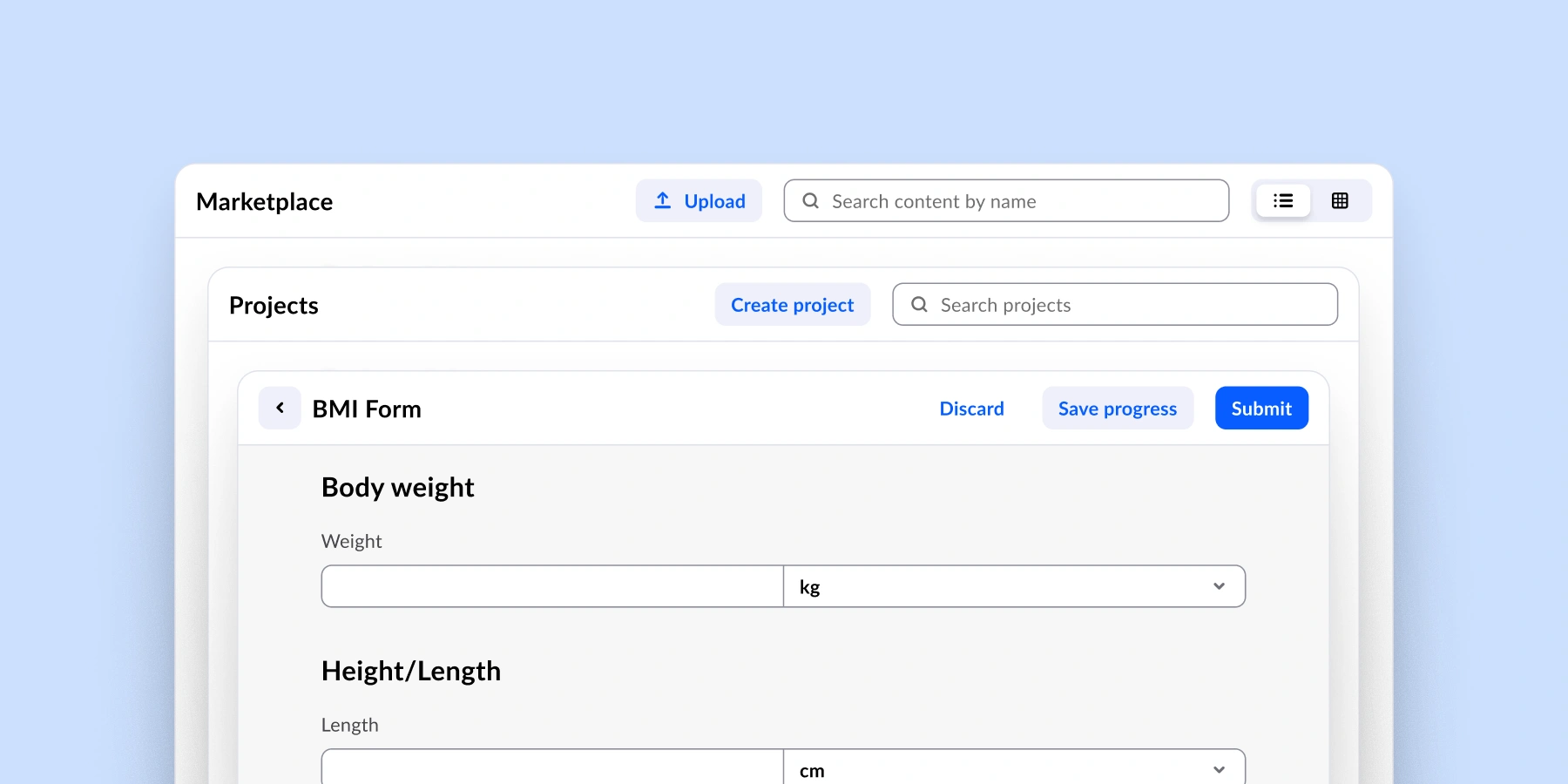
Top bar provides a consistent, accessible home for the information and actions that belong to the current screen.
With Top bar, teams can:
💻 Display titles, actions, and additional components like search or filters within a structured, accessible layout.
🔗 Integrate context-aware tools that help users operate on the content in front of them.
🎨 Maintain visual consistency across different views and product contexts.
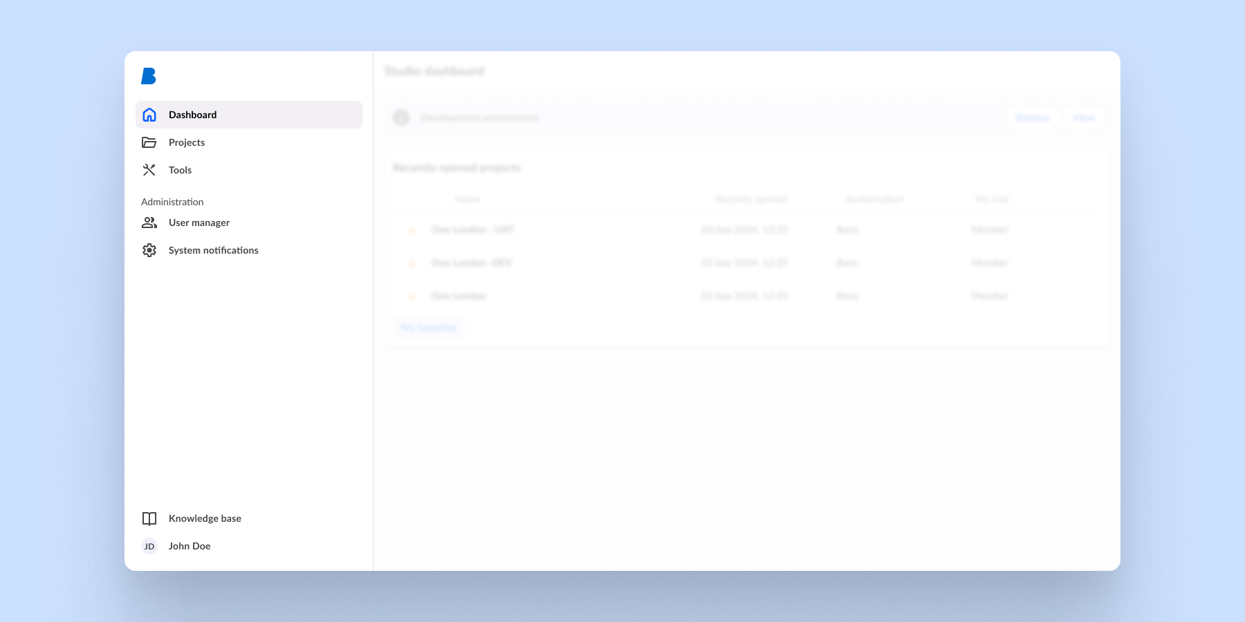
Side navigation
A structured component for hierarchical navigation across application sections.
With Side navigation, teams can:
🗂️ Organise multi-level navigation clearly and accessibly across complex application structures.
🧭 Guide users through clinical workflows without losing context, no matter how deep the journey goes.
📈 Scale navigation as the application grows, without needing to revisit or rebuild the underlying layout pattern.
New features on existing components
Beyond the headline additions, 2.2.0 includes meaningful updates to existing components:
Paginator now supports first and last page navigation buttons. For long data sets, this reduces the number of steps needed to reach the start or end of a list, a small change that matters when users are moving through patient records or search results repeatedly.
Expansion panel adds a slot for the title area, giving teams the flexibility to include custom content or actions in the panel header. Previously, the header could only hold plain text. Now, patterns such as inline status indicators or structured data entries like medications or patient details, can be easily expanded.
Date picker introduces a no manual input property for contexts where free-text date entry needs to be restricted, for example appointment booking flows or structured data capture forms. This release also includes additional stability improvements to the component.
Split button adds toggle button support. This extends its usefulness in toolbar and action group patterns where a split button needs to reflect an active or inactive state.
Accessibility improvements continue across the library. This release adds additional keyboard accessibility support using the Enter key on relevant components, building on the systematic work started in earlier releases.
Every component, fully tokenised
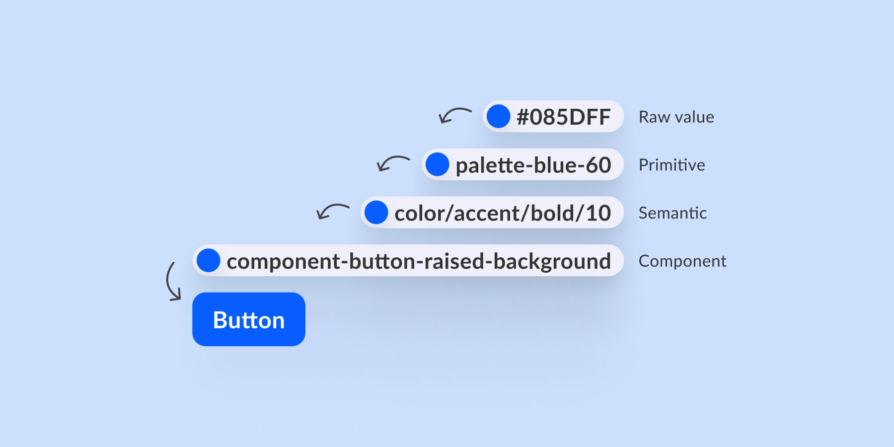
From the start, BDS was built on a simple principle: Every visual decision should be expressed as a token. With 2.2.0, that work is complete.
Every component now ships with a component-layer token set. The design decisions behind spacing, colour, typography, and interaction states are no longer abstracted away in the semantic layer. With BDS 2.2.0, they are fully exposed, documented, and overridable.
In practice, this unlocks a new level of theming flexibility. Teams building on BDS can now create custom themes that go well beyond swapping a brand colour. You can tune the feel of individual components to match specific product requirements or customer branding, all without touching source code and without stepping outside the consistency guarantees the design system provides.
For healthcare specifically, this matters a great deal. Products, portals, and customer deployments often need to look and feel distinct from one another, yet still share the same reliable, accessible component behaviour underneath. Full component tokenisation is what makes that possible at scale.
What is next for Better Design System?
The library continues to grow, and we have a lot of new and exciting things in the works.
One of the most significant initiatives underway is our new Angular directives layer. We are actively developing Angular directives that will cover all our web components, bringing a more natural and streamlined integration experience for teams building in Angular. Rather than working around the edges of the framework, BDS components will feel like first-class Angular citizens. This has been a frequently requested improvement, and we are excited to be making it a reality.
Beyond that, we will continue to expand component coverage, deepen customisation options, and strengthen the foundation BDS provides for healthcare application development.
While we build what’s next, explore the components, patterns, and foundations already helping teams create healthcare applications.