
Healthcare interfaces need to communicate clearly at every level, from a single field on a clinical form to a system-wide status message. Better Design System (BDS) 2.3.0 addresses both ends of that experience, closing gaps in the component library while strengthening the foundations developers rely on across frameworks.
The release introduces two new components, System banner and Button toggle group, alongside three library-wide improvements: native Angular directives, extended accessibility work, and a new “magic variant” that helps you identify AI-made changes to form fields and buttons.
New components: Clearer status, cleaner choices
BDS 2.3.0 adds two components that address recurring needs across Better products: communicating system-wide information clearly and grouping related options consistently.
System banner
Until now, we didn’t have a holistic solution to cover system-wide notifications and status changes. The inline banner component that already exists within the BDS library covers contextual messages inside a section, but teams needing to flag scheduled maintenance, a new version, or a training environment needed something purpose-built to make message visible and available.
The System banner components fulfills exactly that need. It sits at the very top of the screen, spans the full width, and pushes the interface down rather than sitting over it, never obscuring the content underneath and impossible to miss.
With System banner, you can:
- Flag system-wide updates, scheduled maintenance, or training environments with a persistent, top-of-screen banner
- Choose the right level of urgency, from a routine update to a critical warning, using three severity tiers: System, Warning, and Critical
- Give users a direct next step with an optional action link, alongside a manual dismiss
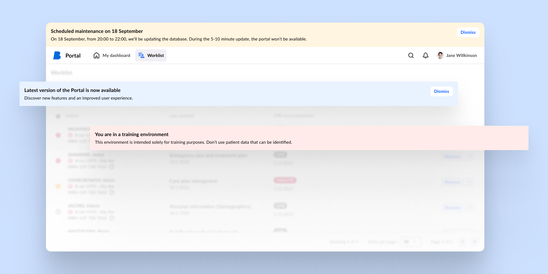
Inline banner remains the right choice for contextual messages within a section or modal. System banner is for system-wide information that every user needs to see.
Button toggle group
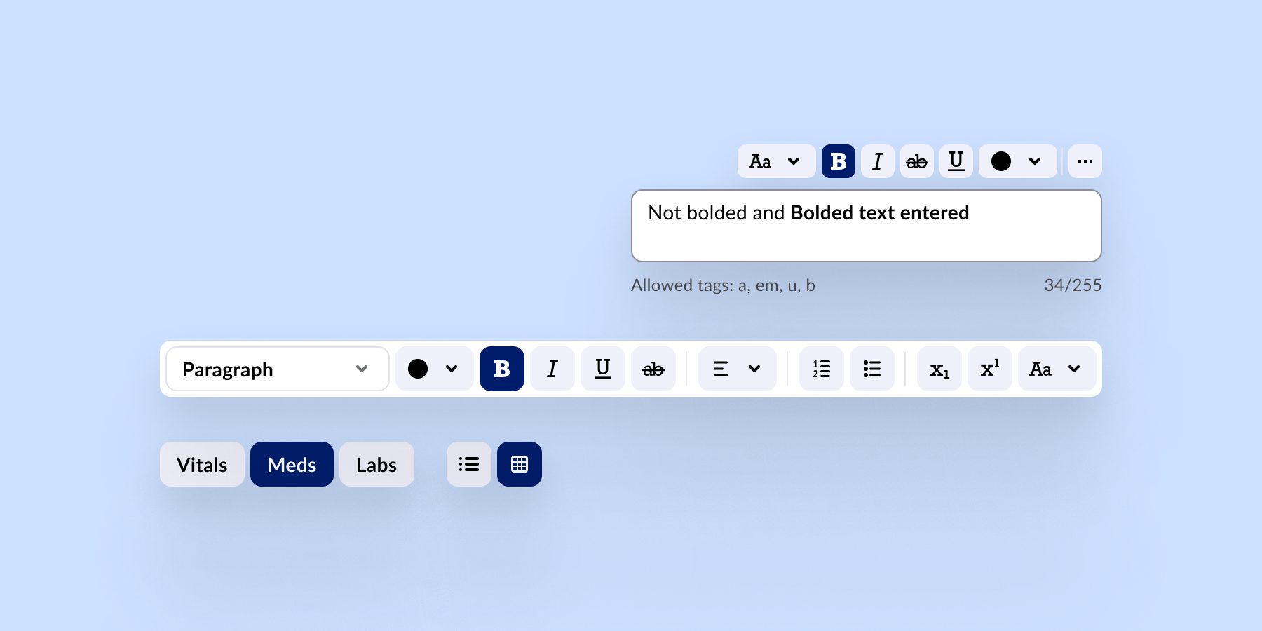
Button toggle group gives you a consistent, governed way to group related options. Built on the existing Button toggle component, it adds defined anatomy, style tokens, and keyboard behaviour so you no longer need to assemble the pattern yourself.
With Button toggle group, you can:
- Let users switch between a small set of mutually exclusive options, with option for single or multiple selection
- Compare or change modes and views quickly, without navigating away from the current context
- Rely on consistent grouping, spacing, and keyboard behaviour out of the box, instead of rebuilding the pattern each time
New features on existing components
Beyond the two new additions, 2.3.0 also brings an update to the Table component, which can now:
- Support multi-row selection, making it possible to act on several records at once instead of one at a time
- Allow a sticky header and subheader slot, keeping key context in view while scrolling through long content sections and tables
We have also expanded capabilities for the Popover component, which now supports an optional header. This gives you a clearer way to present and showcase what is inside it.
Unifying systems and closing the gaps
The three improvements launched with BDS 2.3.0 answer three different problems, but the goal is the same: Close gaps that would otherwise cost you time, compliance risk, or trust.
Native Angular directives
Angular teams can now work with every BDS component through a dedicated Angular directive, giving them a more native Angular development experience. The directives sit on top of the existing framework-agnostic Web Components library, so the same BDS components remain available across frameworks.
Extended accessibility
Governments, as well as national and international health organisations, are putting accessibility at the centre of digital healthcare, expanding the effort from a compliance checkbox, into a coordinated effort to make it a genuine marker of quality of care.
Accessibility has always been one of the core values in BDS, and we want to lead that effort rather than simply follow it. We have added automated accessibility testing alongside manual keyboard and screen reader testing across the library, moving BDS further towards full alignment with WCAG AA, the industry benchmark for accessible design.
AI transparency with magic variant
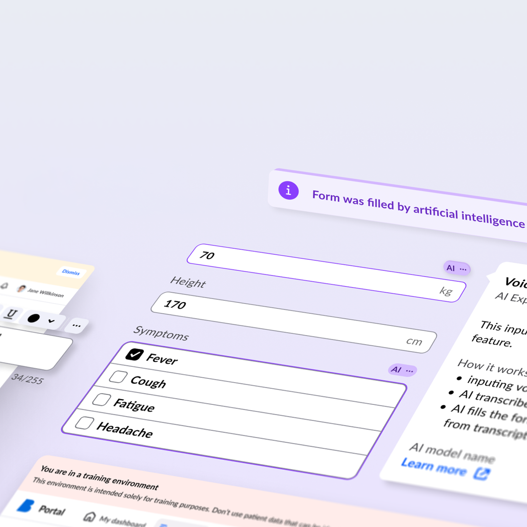
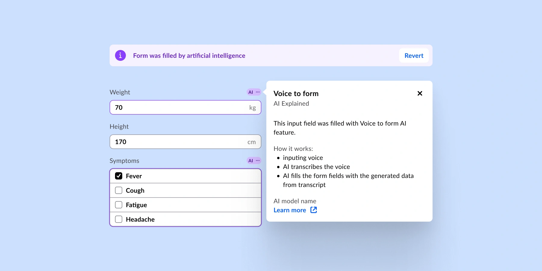
The magic variant fulfills a specific new requirement from the EU AI Act’s transparency rules, where AI-generated and AI-assisted content must be clearly indicated to the people using it.
Form field components and buttons now carry a distinct visual marker whenever they have been touched or generated by AI, setting them apart from standard, manually authored elements. This is solved once, inside the design system, rather than left for each product team to figure out on its own.
What is next for Better Design System?
We are in the second half of the year, but the BDS team is not slowing down. Another release is planned in Q4, which will bring new components to the BDS library, and following on our objective to constantly and consistently improve accessibility.
“We are already working towards the next BDS release, alongside new clinical components, visualisation components, and wider component coverage for Better Marketplace and Better Studio. Accessibility work continues past this release too. Alongside all of that, we are using this quarter to refine the roadmap for 2027. Stay tuned.”
Valentin Grudnik, BDS team lead
While we build what’s next, explore the components, patterns, and foundations already helping teams create healthcare applications.