


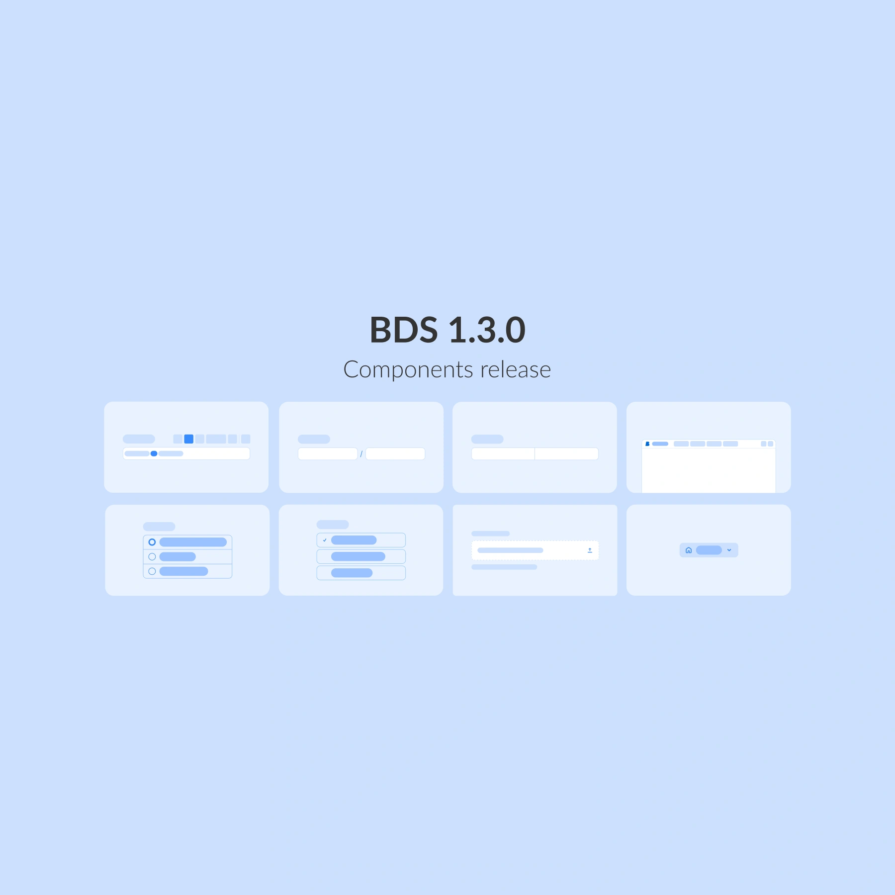
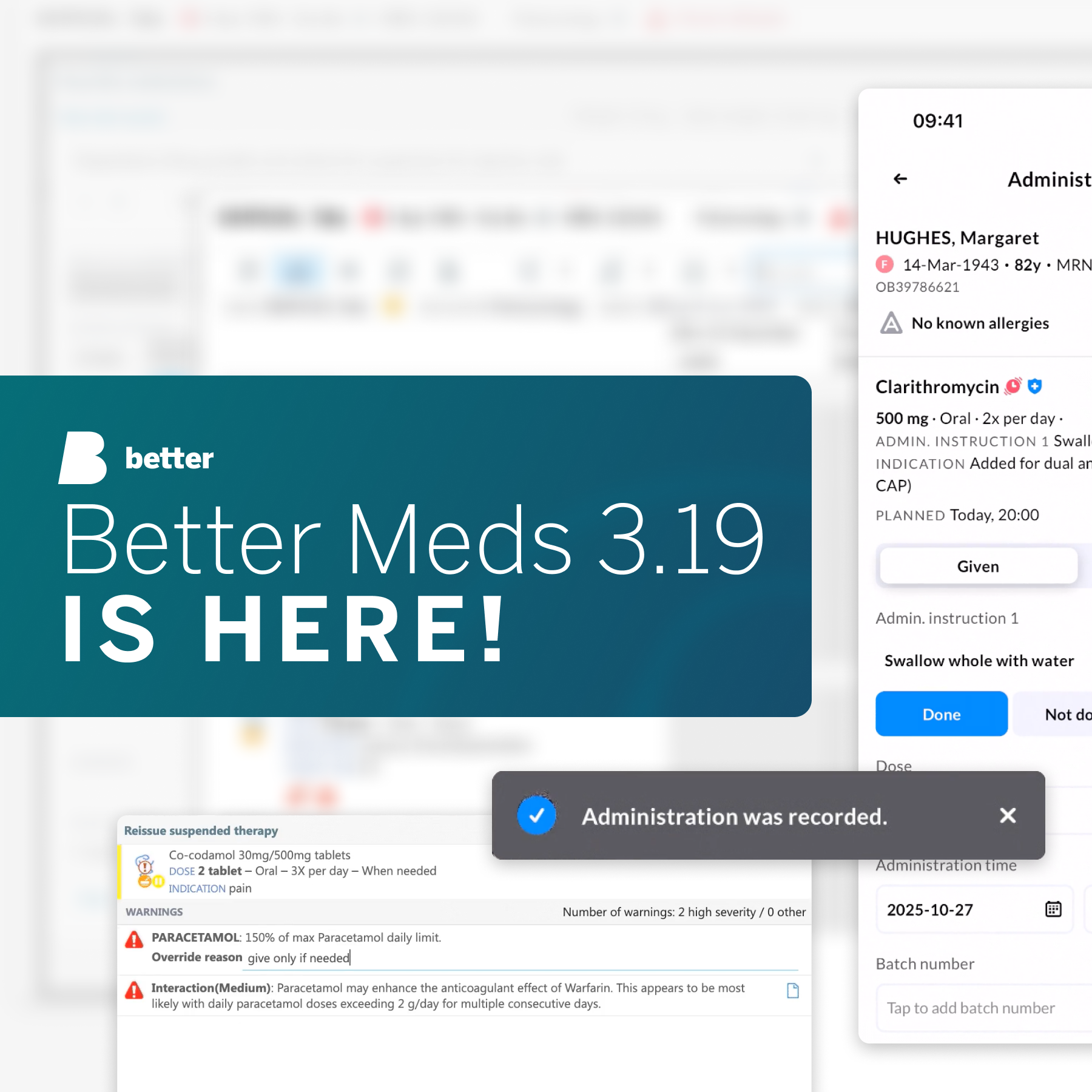
The Better Design System 1.3.0 release focuses on handling more complex data and scaling navigation across applications.
While earlier releases strengthened guidance and interaction, 1.3.0 goes deeper into how data is captured, structured, and navigated. Our goal for this release cycle was to incorporate richer clinical input, provide clearer actions, and implement more scalable layouts. To support these goals, we have added 8 new components to the BDS library, all designed for real-world healthcare workflows where precision, clarity, and consistency matter most.
Form web components for complex data
Healthcare forms are rarely simple. They often require structured input, rich content, and clear actions, all within constrained, high-stakes workflows. BDS 1.3.0 introduces a new set of form components that expand what’s possible while keeping experiences predictable and accessible.
Form button group
This is a structured grouping of single or multiple-choice actions within a form. With spacing, alignment and hierarchy optimised for dense clinical layouts, this component is best used when clinicians need to make clustered decisions and require a clear way to do so.
The group pattern reduces visual noise, ensures keyboard accessibility, and encodes clear hierarchy, which is key for predictable and accessible healthcare UIs.
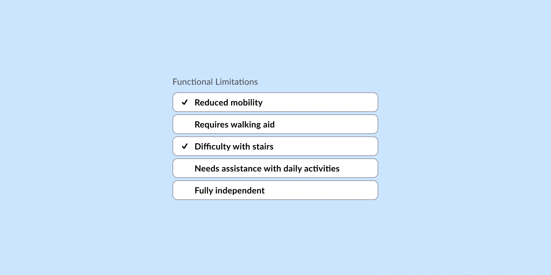
Form button groups can be used for:
📝 Pre- and post-op checklists
✏️ ED assessment forms
✅ Consent forms and status updates
Proportion field
Proportion field is a specialised input for proportional or ratio-based values where accuracy and unit pairing matter. In healthcare UIs, proportion inputs reduce calculation ambiguity and standardise how composite values are stored and rendered, making it invaluable for queries.
Generic numeric fields often force users to mentally combine parts of equations, increasing cognitive load and error risks. A proportion-aware control captures both parts of the relationship with validation and formatting at the point of entry, which aligns with BDS’ move toward components that support structured, complex data without sacrificing usability or accessibility.

Proportion field is useful:
⚖️ when capturing doses per weight (dose per kilogram)
🧪 for displaying drug vs carrier ratios
📈 to implement limits and amounts for anything with a specific safety range
Rich text editor
This is a structured, formatted text input for cases where plain text is not enough, especially useful for headings, bullet lists, emphasis, and embedded references. Modern rich text editors (RTEs) now favour modular, framework-friendly architectures to keep UIs responsive.
We have developed RTEs because clinicians need nuance, while systems must keep notes parseable and safe, balancing comfort with clear semantics.

Rich text editor (RTE) is ideal for:
📝 clinical notes, assessments, lists, and summaries
📄 detailed documentation or dashboards that summarise key care points
🧠 PROMs narrative widgets where patients’ narratives are captured
Split field
Split fields break complex values into smaller, logically grouped inputs. Hospital workflows depend on identifiers with embedded semantics (example: weight in kilograms, height in centimetres, etc.). Free-text inputs make validation, search, and analytics harder.
Split field helps teams encode structure at entry, so forms remain predictable and queries reliable.

The split field is ideal for:
🔢 codes, identifiers, or segmented values in cases such as triage assessments
📋 structured data entry
🧩 improving readability and error prevention
Top navigation built for scalable products
As healthcare applications grow, navigation needs to move beyond individual screens and support product-wide structure and orientation.
A product-level navigation pattern provides clear orientation and structure, establishes hierarchy, improves wayfinding, and aligns with accessibility and performance goals set for BDS.

Top navigation is best suited for:
🧭 primary application navigation (patients, orders, care plans)
🗂️ switching between key product areas
🚀 establishing a scalable app shell
What else is included in this release
The new release of Better Design System includes:
🔹 Form elements: Proportion field, Split field, Form button and Form button group, Upload, Rich text editor
🔹 Navigation: Navigation link, Top navigation
These components are designed to work together, enabling teams to build richer forms and clearer navigation without sacrificing consistency or accessibility.
What is next for Better Design System?
BDS continues to evolve toward supporting end-to-end healthcare workflows, not just individual screens.
In the next months, you can expect:
🧠 Expanding our component library to cover more clinical content.
🌍 More ways to navigate with new navigational components.
We are building a design system that grows with you, faster, smarter, and always ready for the future of healthcare UX. Do you want to know more about Better Design System?