


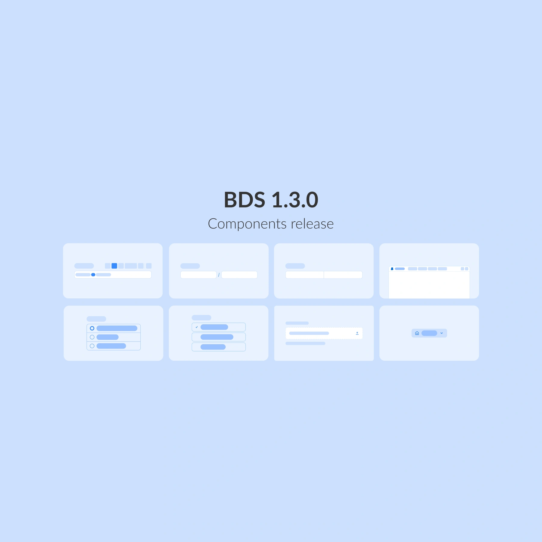
Better Design System 1.2.0 is here, bringing powerful enhancements to healthcare UX ! This update introduces a multifunctional set of components focused on navigation, interaction, and clarity, making it easier than ever to build intuitive, accessible, and consistent healthcare applications.
From smarter forms to guided workflows and better data display, this release expands Better Design System (BDS) with 11 new components.
New form elements
We have added new, intuitive form elements like Date picker and Checkbox group for effortless scheduling and flexible option selection. Together with our existing components, these upgrades make capturing, managing, and interacting with data faster, clearer, and more reliable.
Date picker
A fully interactive calendar to simplify scheduling and time-based navigation.

Ideal for:
- 📅 Appointment booking
- 🗓️Task planning and scheduling
- ⏱️Time-sensitive workflows
Checkbox group
The Checkbox group component allows users to select one or multiple options from a list, making forms and settings clearer and flexible.

With Checkbox groups, users can benefit from:
✅ Selecting multiple options efficiently
⚡ Compact and adaptable layouts for forms or filters
🎯 Keyboard-friendly, accessible design for all users
Navigation and structure
Great experiences need more than components, they need flow.
This release introduces new navigation and structure tools: a menu for clear choices, a Stepper to guide users through multi-step journeys, and a Tree view to bring order to complex data.
Together, they make it easier to design interfaces that are intuitive, structured, and ready to handle even the most complex healthcare workflows.
Menu
The Menu component provides structured, hierarchical options for quick navigation and actions.

With Menus users can benefit from:
- 📋 Context menus, drop-downs, and action menus
- 🚀 Compact and flexible use cases
- 🎯 Keyboard-friendly, accessible design
Stepper
Guides users through multi-step workflows with clarity and confidence.

The Stepper component is designed for:
- 🧭 Multi-page forms or wizards
- ✅ Clearly indicating progress and status
- 🎯 Reducing errors by breaking tasks into smaller steps
Feedback and guidance
With a component like Banner for inline updates, BDS makes sure users always know what is happening, what is next, and what needs their attention. Designed to inform without overwhelming, our feedback and guidance tools keep healthcare workflows smooth, focused, and reassuring.
Banner
The Banner component delivers clear, inline messages that keep users informed without interrupting their workflow.

With Banners, users can benefit from:
- 🚨 Highlighting important alerts or updates
- ℹ️ Providing contextual information in the flow of content
- ✅ Communicating success or confirmation messages
What else is included in this release?
The new release of Better Design System includes:
🔹 Form elements: Calendar, Checkbox group
🔹 Navigation and structure: Menu, Stepper, Tree view, Breadcrumbs, Link, Search
🔹 Feedback and guidance: Banner
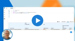
🔹Information display: Avatar, Data list
More components will be added in upcoming releases as we continue expanding and refining the system.
What is next?
BDS will continue to evolve with additional components, richer customisation, and stronger accessibility, allowing your products to scale with confidence.
On the horizon:
🚀 Expanding our component library to cover even more workflows
🌍 Accessibility enhancements aligned with WCAG and EAA
We are building a design system that grows with you, faster, smarter, and always ready for the future of healthcare UX. Do you want to know more about Better Design System?