


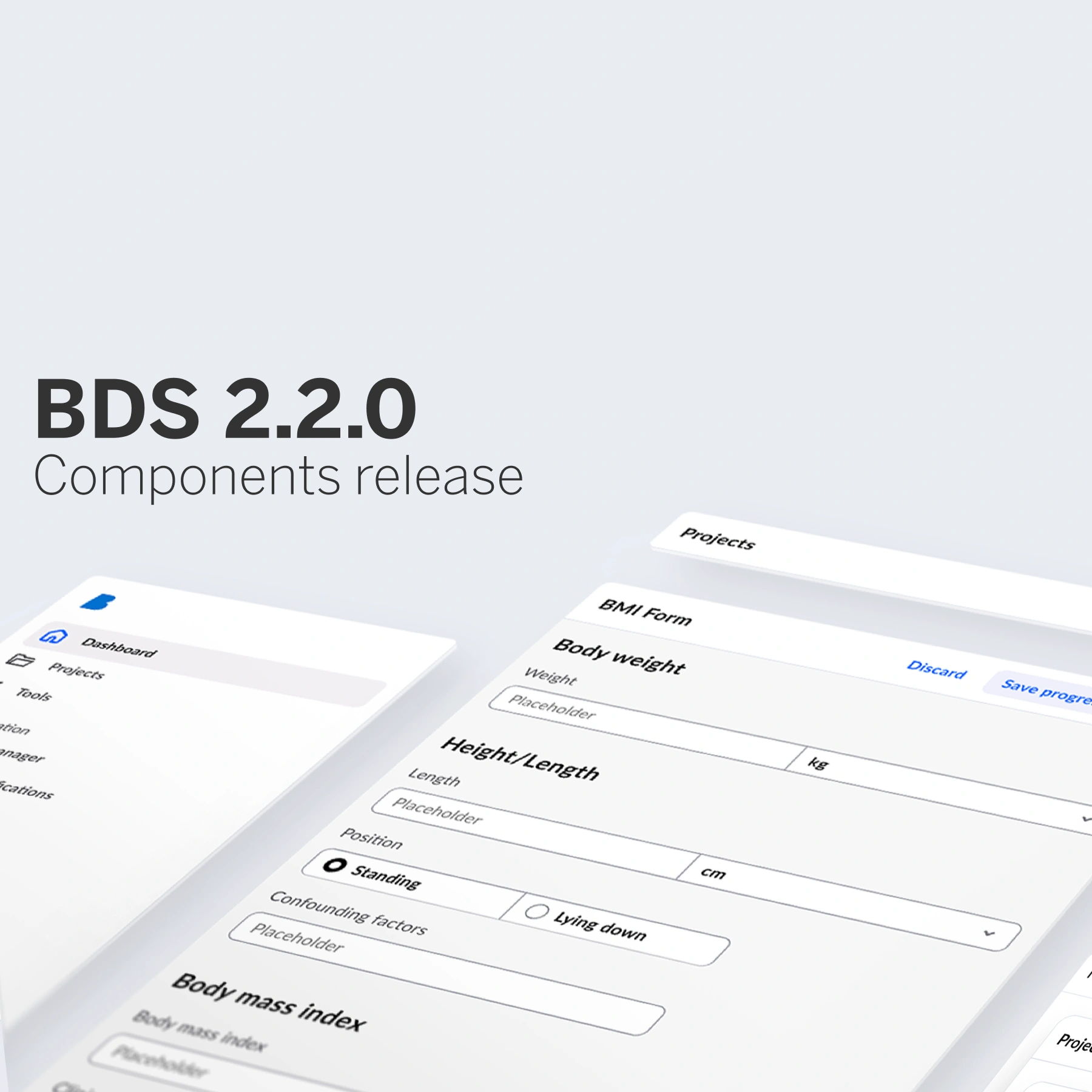
We are thrilled to introduce the latest additions to the Better Design System (BDS)! This release brings a fresh wave of UI components—covering overlays, floating elements, and notifications—designed to enhance interaction and clarity. We have also expanded our form elements with Slider, Combobox, and Radio Group components, making data entry and selection smoother than ever.
What are floating elements?
Floating elements are UI components that appear above the main interface and are positioned relative to a target element or viewport. They “float” visually over the rest of the page without affecting the layout around them.
Dialogs
BDS Dialogs are modal windows built to deliver critical information or capture essential user decisions. We make it clear, accessible, and without distraction.

They appear above all other content and demand attention, making them perfect for:
🚨 High-stakes alerts
✅ Confirmations
🚫 Communicating errors
Because dialogs are inherently interruptive, they should be used thoughtfully. Make them work for you only when a user must act before continuing.
With BDS, every dialog comes accessible by default, is theme-aware, and is designed for maximum clarity.
Popovers
Popovers in BDS are lightweight, focused UI elements, that appear just when you need them—never too soon and never too late.

They are perfect for:
💬 Contextual help – Show tooltips or guidance exactly where users need it.
📌 Extra details – Reveal more information without cluttering the main UI.
🧭 Guided steps – Help users to complete tasks with progressive, focused prompts.
They float above the interface to deliver context-specific information or prompt quick user input without disrupting the overall flow.
Sidenav
The new Sidenav component in BDS lets you expand your interface without overwhelming it.

They are mainly used for:
➕ Adding depth without distraction and disturbing interface.
🔎 Collapsable filtering panels and view settings.
ℹ️ Providing additional information to the main content.
Easier choices in forms
Forms are at the heart of our interfaces and are now more powerful than ever. With new components like Combobox, Slider, and Radio Group, they give users more intuitive, flexible ways to enter data and make the choices that matter.
Combobox
The new Combobox component combines typing with suggestions, helping users quickly find what they need from long lists.

With Combobox, users can benefit from:
⏱️ Faster inputs.
🔡 Type-ahead suggestions.
📋 Ideal for large or dynamic datasets.
It’s perfect for speeding up workflows, reducing errors, and keeping your UI clean and efficient.
Slider
The new Slider component lets users fine-tune values or select values with a simple drag.

Slider components are ideal for:
⚡ Immediate updates.
↔️ Single or range selection.
🎯 Preferences, thresholds, and more.
Designed for real-time feedback and seamless interaction, it’s perfect for settings, filters, and anywhere instant adjustments matter.
Radio Group
The Radio Group component helps users make single selections from a set of mutually exclusive options.

We use Radio Group when we want users to have:
✅ One choice, zero confusion.
🧩 Great for forms and settings.
🎯 Enhanced usability with accessible, guided selection.
Designed for clarity and ease of use, it simplifies decision-making and keeps forms fast, focused, and intuitive. With BDS Radio Group, every decision can be straightforward.
What else is included in this release?
The new release of Better Design System includes:
🔹 Form elements: Combobox, Slider, Radio Group
🔹 Action components: Button Toggle, Split Button, Segment Control, Paginator
🔹 Structural components: Card, Sidenav, Expansion Panel, Divider
🔹 Feedback components: Snack Bar, Dialog
🔹 Status and information display: Popover
More components will be added in upcoming releases as we continue expanding and refining the system.
What’s next?
In the coming months, BDS will grow even stronger—with more components, more flexibility, and even better accessibility. And we are just getting started!
Here is what is on the horizon:
🚀 New components to cover more use cases and product needs.
🎨 Advanced theme options for deeper customisation.
🌍 Enhanced accessibility aligned with global standards like WCAG and EAA.
Stay tuned as we continue building a design system that’s faster, smarter, and ready for the future of healthcare UX.
Do you want to know more about Better Design System?