


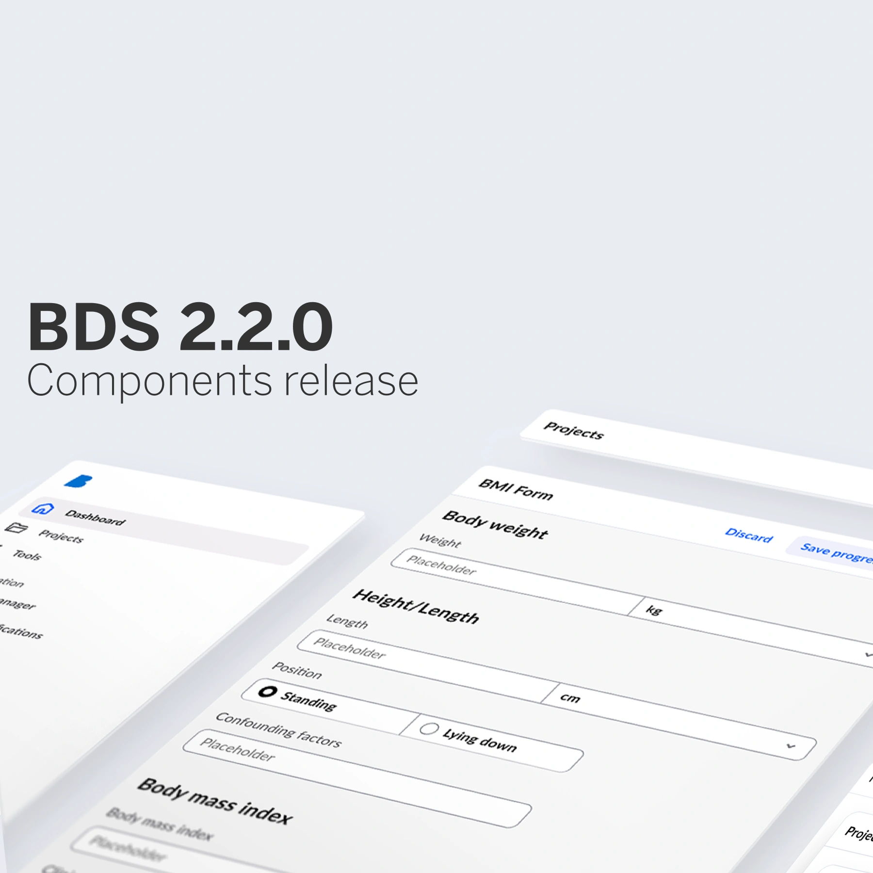
We are excited to introduce the next generation of our Better Design System! This release brings a fresh, accessible design and a new technical foundation using Lit, ensuring our components are lightweight, framework-agnostic, and ready for the future.
A fresh start: accessible, lightweight, and future-proof

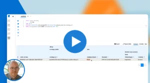
The pictures above might look similar – but within, they are completely different as we have completely changed the architecture of design system, by moving to web components.
The shift to web components isn’t just a minor upgrade – it is a complete architectural transformation. Our previous system was deeply integrated with Angular Material, limiting its adaptability. Now, with web components, our design system is more modular, efficient, and widely applicable across different frameworks and technologies.
What are web components?
Web components are browser-native, reusable building blocks that encapsulate HTML, CSS, and JavaScript into custom elements. Unlike traditional component libraries, which are often tightly coupled with specific frameworks, web components are inherently framework-agnostic.
This means:
✅ Consistency – The same components work across React, Angular, Vue, or any other framework or even no framework at all.
✅ Performance – Native browser support eliminates unnecessary overhead, ensuring fast loading times.
✅ Style isolation – No more CSS conflicts – each component maintains its styles regardless of where it is used.
✅ Long-term flexibility – Future-proof by design, reducing dependencies on any single technology.
Why did we migrate design system to web components?
The shift to web components offers several advantages:
- Performance: Native browser support reduces overhead, improving speed and rendering.
- Framework independence: Works with any framework or no framework at all.
- Ease of maintenance: Modular design simplifies updates and long-term maintenance.
- Reusability: Self-contained components can be used across different projects.
- Broader adoption: Custom components can be shared across multiple products, fostering collaboration.
What is included in this release
The new version of BDS launches with a solid foundation of essential UI components, ensuring a smooth transition for our users:
🔹 Interactive elements: Button, Input, Select, Checkbox, Radio Button, Slide Toggle
🔹 Structural components: Table, List, Tabs
🔹 Feedback components: Progress Bar, Progress Spinner, Tooltip
🔹 Status and information display: Tag, Badge, Icon
And this is just the beginning! More components will be added in upcoming releases as we continue expanding and refining the system.
Accessibility first
With BDS, accessibility isn’t an afterthought—it is a core principle. We have ensured compliance with WCAG 2.2 standards and prepared for EAA 2025 (European Accessibility Act). Key accessibility enhancements include:
🎨 Color palette updates – Adjusted blue and red tones for better contrast and readability.
🔲 Enhanced focus states – Clear visual indicators for all interactive components, improving navigation for keyboard and screen reader users.

Moving to Lit and web components
One of the biggest changes in this release is our transition from Angular Material to Lit. Lit provides a lightweight, modern approach to building web components, allowing us to:
⚡ Build highly efficient, fast components
🎯 Keep components lightweight by avoiding unnecessary dependencies
🔧 Ensure seamless integration with any framework or application
Expanded theming options

We’ve extended our theming capabilities beyond just light and dark modes. Now, you can choose themes designed for specific applications and user needs:
- Clinical application theme – The default theme, optimised for clinical use.
- Tooling theme – A denser theme, ideal for tools and utilities.
- Patient-facing theme – Features more white space, improving usability for patients with accessibility needs.

Currently we focused on spacings and layout with the new themes. Providing denser theme for more specialised users using our tools and more white space and bigger UI elements for patients using our patient-facing software.
What’s next?
This is just the beginning! Over the coming months, we will continue expanding the component library to match and surpass the full set of Angular Material components. Expect:
🚀 More components to support a broader range of applications.
🛠 Even more customization options for fine-tuned theming.
🌍 Stronger accessibility features to meet evolving global standards.
Stay tuned for future updates as we continue to enhance Better Design System making it faster, more flexible, and even more powerful.
Do you want to know more about Better Design System?